Tuesday, 11 March 2014

Pathways Project - Celebrating The Ballpoint Pen 3


Catherine and The Fabulous Flying Hair!!

I just loved drawing this picture, to me it screams celebration because she's obviously moving her head around like crazy, as though she were dancing and having a good time. (That and I love her hair in this picture.)
 
First Set:
 
Andy Warhol style pattern; One that I think would make a funky shirt (Or bedsheets actually).

Second set of patterns:
I love the shiny waves and swirls effect, they make me think of the kind of fancy wallpaper you'd find in an old Victorion household.


Third set of patterns:
Digitally coloured (No paticular reason for the selected ones; I just went with what I believed suited the picture.) and I basically started off with the same pattern style as the one above (Just coloured) but then tried to move onto something different.

 
Gingham style patterns:


Of the two above I don't know which one I prefer; I felt that the first one was a bit bare with all the blank spaces so I tried to fill it in with black and white pictures of Catherine. On the whole I believe its funky, but wether it's too much or not; I feel as though I'd have to test it on some kind of fabric to see for sure (If I had the time I would have loved to print this on a dress).

Pathways Project - Celebrating The Ballpoint Pen 2

Another set of pattern designs, made from the one original drawing
Fine art, pen drawing
 
Digital editings


Awesome Patterns for a shirt


And for the one below I was think; skirt

 
I love this particular set of designs, probably my favourite for the "Applied crafts" side of the project; if I could make clothes i'd use these patterns.

Friday, 7 March 2014

Pathways Project - Celebrating The Ballpoint Pen 1


For "Pathways Project" at college we recieved our first brief at the end of January; (we were given the choice between four topics and I chose:) "How do you celebrate the ballpoint pen?" and we have to refer to all three pathways as we work through the topics (Contemporary Art, Applied Crafts and Design and Visual Comunication.). After a couple of weeks of research and deciding what to do, I decided to start by drawing scenes of "celebration", in this case I've based my work on a series of photos of my classmates and I having a fun night out partying in November last year. This is the first set of drawings I've done (Using only pen) and a series of photoshop edited patterns I've made using them.
Contemporary fine art

Contemporary Fine Art.


Repeated pattern in black and white.
 
Border design tryout.


 These particular coloured pattern pieces were made using photoshop on Tuesday 4th March

Applied Design Crafts
I was thinking that I could use patterns like these for clothes and furniture; simple looking from a distance but more detailed up close. My main source of inspiration for the "Applied Design Craft" pathway of my topic is the "Timorous Beasties" Art group. 

Transformaton - Photoshop - Colouring sessions continue

After our class on the 7th, we had a week off from college, so our next session for "Specialist Skills" wasn't until the 21st. Turns out, we actually had another session on colouring our drawn pictures; only we were to do another picture. This actually came as a surprise to the class, we were expecting to learn something new, so I had no prepared drawing to work from and had to quickly draw one in class so I could get down to work. Well because I was pressed for time, I wasn't very imaginative, I just drew another picture of Amalthea (One of these days i'll be more inventive) but I was going to try make it look as though she's just about to transform back into a unicorn at the end of the story.


After that day however, we have begun working on the illustrator program and I' not sure when I will next continue (Or even finish) this particular piece. I think to be fair this is simply a test piece for using photoshop. Despite the fact that I'm not likey to finish this, I definetely feel more confident in using photoshop and would like to use it ore in future.


Tuesday, 25 February 2014

Transformaton - Photoshop - Amalthea's Face

On the 7th of Febuary, for "Specialist Skills" we were told to draw (simple outline in pen) something related to our chosen theme so we could colour it using photoshop. I decided to draw Amalthea's face; I thought I should do something simple since I tend not to actually draw and colour on photoshop.
 
1. So, this is the original sketch; did not like it at all. As much as i wanted to draw a much prettier and detailed picture however, I thought it was sensible to keep to this one (Also we only had the one class to go over it).
 
 
2. When I started colouring it; trying to use the bucket tool whenever I could; I felt much better about the picture. I used the smudge/blend tool for the eyes and for the diffeent shades of her skin. 
 
 
3. I'm very proud of the face, I was using the college computers at the time and could only use a mouse, but I believe the features turned out very well. I was pleased with the lips (Thats whats new about this picture) but after I reached this point I felt confident enough to continue the drawing, while not constantly saving it when I added something new.
 
 
4. The finished piece!
 
 
Like I said, I stopped saving it at different points of development because I felt confident I wouldn't make any mistakes. All that was left to do was the hair and the mark on her forehead anyway. I went a bit nuts with the hair; I finished it later at home where I had access to an electric-sensor-pad-pen-thinie-for-photoshop (...I don't know what its called; it's my sister's) and because it was so much easier to use than the mouse for drawing on photoshop, I ended up just colouring it as though I was using pencils (And I used the smudge/blend tool a lot too). I like how it looks almost as though it was done using acrylics and even though its not as neat as how I originally drew the hair, the only thing I was disappointed about was that I had trouble keeping the original curls and swirls of her hair (All the swirls have blended in together, they're no longer as distinctive as they were supposed to be; still love it though!)
 
I'm very pleased with how this has turned out, I think it's quite pretty and I liked how I could zoom in for all the extra details, so I believe this is something I will use again for my future works.


Transformaton - Motivation and Photoshop

Sorry I havn't blogged on this since November, I'd like to say that it was all due to the lack of internet - we moved house in January and there is literally no internet connection in our new house, sucks - but if i'm being honest it was also due to a lack of motivation. It's funny, because whenever I do begin a blog, i actually get into it, my problem is finding the will to start it in the first place (kind of like when you're trying to read a book; i'm in the middle of one right now, i'm genuinely enjoying it, want to finish it, but at the end of the day after college and working on my illustrations, i'm just like "...Nuh. Wanna watch Smallville instead.") its pure laziness, and getting pretty bad, which is why i'm trying to make a point of doing my blogs properly from now on.

We began working on photoshop for "Specialist Skills" at college a couple of months ago, and it been quite a fun experience so far. For this class our theme is "Transformation" and my theme is based on the transformation of the book/movie/comic "The Last Unicorn", so of course all my work in "Specialist skills" have to link to my chosen theme. When we first began photshop, I just thopught "How the hell am I going to link all this computer stuff to a transforming unicorn," but after my moment of freaking out, I soon realised just how much i could do with photoshop and how amazing the results can be.

These are a couple of water colour paintings I did months ago in my sketchbook, they were actually done on a whim and I honestly wasn't sure what to do with them as they wearn't based on any techniques we'd learned in our workshops. However when we began working on photshop techniques I finally came up with a use for them.

The Unicorn Transforming

 
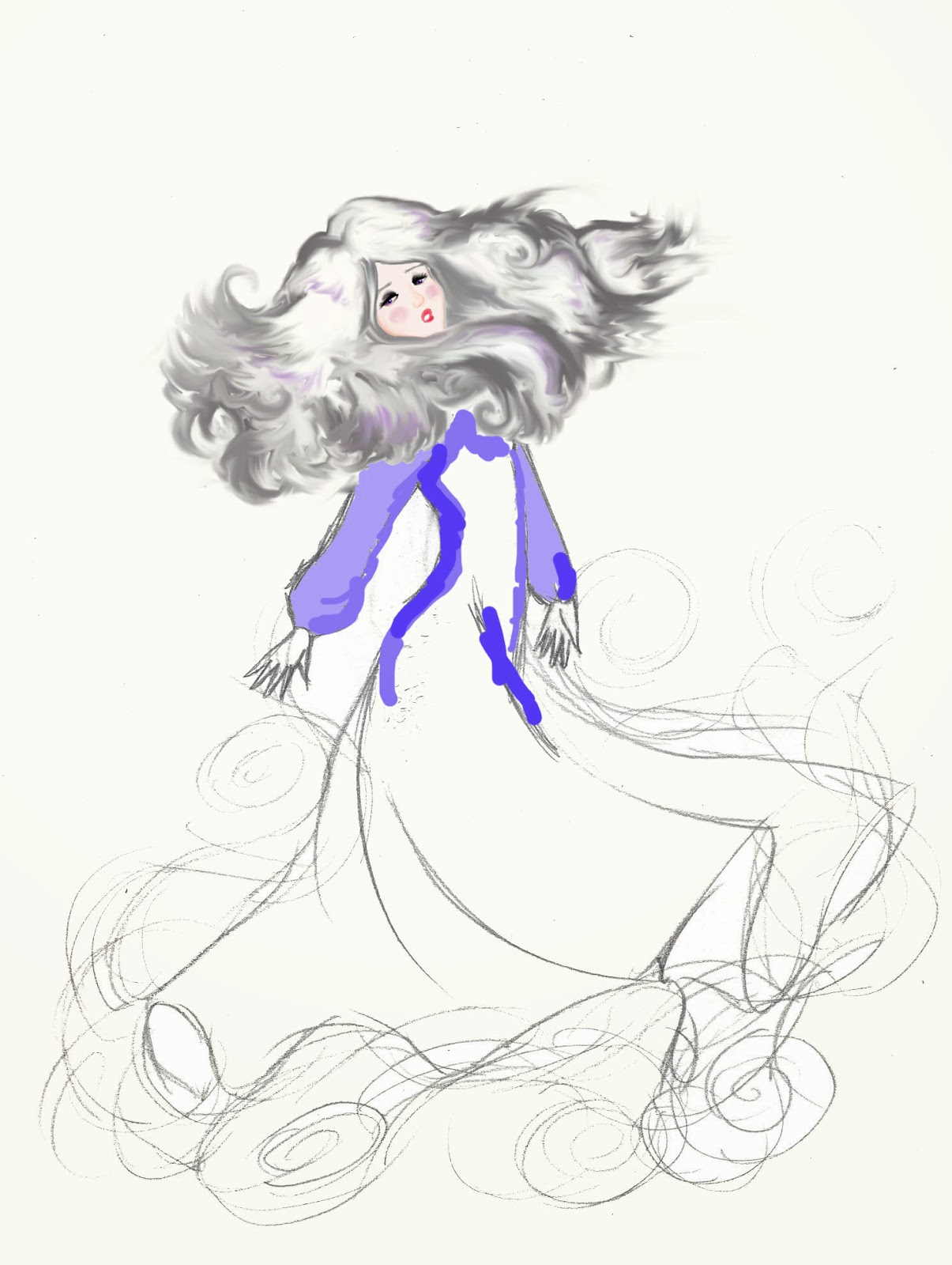
Amalthea Transforming

I decided to combine the two pictures tegether to properly convey the transformation of the unicorn.


I made this piece by combining the two paintings together and I copied and pasted several pieces (The swirls) again and again so the two paintings look more blended together, also for a more magical transforming look. I really love how this turned out, it kinda looks like a funky tattoo, that or maybe an illustration for a book cover:

 
I genuinely love how this one turned out, and even though the techniques were simple, I like to make I created something extravagent and beautiful.
 
Using this piece (without text), we were told to experiment with colour blending:


Unicorn and amalthea - layer blend cream colour - exclusion
 
 
Unicorn and amalthea layer blend light grey difference - layer blend pink - colour dodge
Unicorn and amalthea - layer blend blue - saturation

 
Unicorn and amalthea - layer blend light grey - exclusion

Unicorn and amalthea - layer blend cream colour - saturation
 
Unicorn and amalthea - layer blend blue - overlay

 
Unicorn and amalthea layer blend light grey difference - layer blend pink - saturation

 
Unicorn and amalthea - layer blend pale pink - difference

Unicorn and amalthea - layer blend blue - hue

 
Unicorn and amalthea - layer blend cream colour - difference
 
 I'm very pleased with how all of these pieces came out, it was a lot of fun playing around with the colours etc. I honestly couldn't say which one I like best, I think they're all good, looking forward to playing around with more drawings of mine.