Wednesday, 1 October 2014

BA Art and Design Week 2 Brief 1 - Multiples

I Know I ended the final line in my last post with the word "fro" instead of "for", that was obviously deliberate because I'm such a badass rebel... and the keyboard I was using in college had stiff letters
 
Sorry about late blog, got distracted by my project
 
But for week two we were to plan our trip to Edinburgh, other than that I didn't get much progress for any of my classes.
 
However I finally brought my camera to college and created several videos for "Video Class" 
 
 
This was filmed at my college and stars my classmates and their legs, music from "Wolf Children". The idea of this video was to be like an ending to some kind of coming of age story; a nice, slow, everyone's happy and getting with their lives.
 
 
This was filmed in the sound department at college, I just liked the music equipment and wanted to make a scenery video, but I started to play around with the settings when putting it together and it turned into a dream state kind of video. Music by Bruno Coulais from Coraline.
 
 
This is a video of  a guinea named Kevin, I was babysitting him for a friend for two weeks and fell in love. I just HAD to make this video for him and his fabulousness!
Music "I'm Fat" Weird Al.
 
It was a long week because I didn't know what to do with myself, however on the Friday we finally went to Edinburgh and my favourite place was the museum of childhood, which made me decide to base my project on dolls.


Wednesday, 10 September 2014

BA Art and Design Week 1 Brief 1 - Multiples

I'M BACK!
(Hold your enthusiasm)
 
On the third of September I returned to college, our first classes being, 3D workshops, Pathways and Context (For which this blog is requested for) and Drawing... and we didn't do any! We can't start (Most) our classes properly because of projects for each class requires a trip to Edinburgh (Which will be taken on the 12th this Friday)
 
Our project is "Multiples" and the theme must be related to Edinburgh, hence we all we can do in class at the moment is research, which was exciting at first, but then it got a little boring, and kinda hard. The place i'm most interested in at the moment in Edinburgh is the "Museum of Childhood"; for one thing i believe its a place that would likely suit me and my style (Because that's something our lecturers have encouraged us to do this year; work towards our chosen pathway), and i believe it can involve a number of mutiples; the multiples of toys, types of toys, state of the toys, time from which their from and the emotions I may experience when exploring the museum itself.
 
Thursday, which covered Video practice and mixed media/textiles was the same as the day before; they both require the Edinburgh trip, however in video our lecturer showed us a short video created by David Linch called the Alphabet (It was very disturbing) and has asked us tio make our own videos of the college. In mixed media we just had to continue our research or Edinburgh.
 
The same happened on Friday when we had Painting class, except we were made to do a quiz on painting... didn't do too well. Then there was critical and contextual studies where we were given a powerpoint presentation on "Knowledge is power", it was actually quite interesting and we were talked through the timetable of the entire class for this year and i'm feeling nervous yet more confident on my essay this year... still not looking forward to it though.
 
That concludes my blog entry fro week 1

Thursday, 29 May 2014

Pathways Project - Journey 4

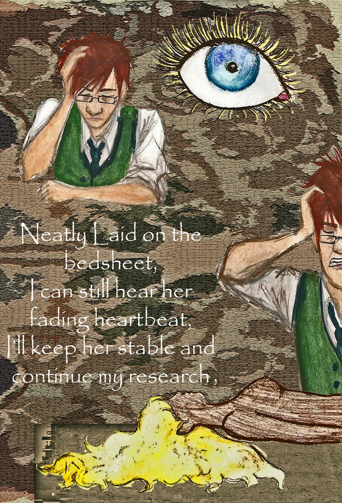
The Finshed Pages
 
These are the official pages which I sewed into my journal for my final piece; I'm very happy with how they turned out. So happy that I was a bit disappointed with how they turned out after I printed them; slightly darker than supposed to be and all featuring a white border which I couldn't remove because I printed them on word. There was no major damage otherwise; some of the pages were missing their original edges because of the borders (which overlapped them), but thankfully none of the words of pivotal images were cut out.
 
However this is why I'm happy I have this blog, so I can show people how the pages are really meant to look in all their glory.
 
One little note I forgot to add into my sketchbook:
"Please Listen to song while reading the book, to help fully appreciated the emotions/story/themes I am trying to convey with my work, thank you."
 
And I recommend the same to whoever is reading this blog.


Unfortunately I am Aware That I have missed out a line between these pages, I myself am very unhappy about this; but I did not discover this until after I had printed everything and was sewing together the final piece the night before the hand in. Hence I had no time to fix this.


Another wee mistake: "Say" should be "Pleading"


I hope you all enjoy reading this (and are not too disturbed), I am very proud of my work and hope to use illustration more for my future projects.

Pathways Project - Journey 3

The Book!
Final Piece For: 27/05/2014
For the book itself, I decided to style it after a journal; going with the idea of it being a "Doctor's" work journal. Throughout the song The Doctor's typing up his findings/research/experiments on how he goes about trying to save his wife, which is why I felt that this type of book would fit the theme; He telling the story and its his journal.
 
Its quite simple and only size A5,which I chose because I felt that it was a realistic size for an old doctor's journal and also because I thought it looked neat and gave the feel of a real published book to whoever's reading it.

 
I hand-sewed every part together myself:
 
  • I measured leather to be the same height as the page sizes, and to be wider than half the width of the pages on each side (see below)
  • I sewed the pages together and then sewed them onto the leather (around the middle)
  • When I printed to pages, rather than printing them back to back, I printed them all one sided and stuck them together back to back instead; because I felt that the book could do with a bit of extra bulk and this would help.
  • I sewed straps onto the right hand side of the leather and sewed buttons onto the other side.
  • For the buttons I decided to go with a pair of old fashioned, gold (looking), patterned ones; because I felt that they would continue to convey the Victorian theme but also I thought it would help to make the book a bit more eye-catching/fancy.


Pathways Project - Journey 2

I stupidly Handed In My Sketchbook Before I took Photo's Of The Pages Themselves
 
Sorry.
 
However I will add onto this post, a few examples of my drawings scanned onto my computer; some edited, some normal; to show examples on how I went about making some of my illustrations.

First Sight

I decided to try colouring a couple of my drawings on Photoshop, partly because I wanted to duplicate the same figures three times, just to change the expressions on their faces (Saved me re-drawing the figures three times).


 I like the results, however I decided that colouring the drawings on Photoshop took too long and decided to continue colouring my drawings with water colours (with the exception of Photo-shopping patterns into certain pieces of clothing: Pink dress above).


"And I'll never forget, when we first were courting,
And she faced me, and her eyes were gleaming..."

 
 For Both Man and Woman:
 
Expressions: 1. Notice each other
2. embarrassed to be caught
3. but happy it finally happened anyway.
 
Collage
 
Combining real photographs to my drawings on Photoshop; I wanted certain objects (e.g. Typewriters, mechanical objects) to look realistic to help convey the "Victorian steampunk" theme that comes with the song. However I felt that if I wanted to make realistic drawings/paintings of mechanical objects, just the process of painting them perfectly would take up too much of my time and I wanted to make every page as good as I can (and of course I still had to make the book itself). So I decided to instead just Photoshop the real photos into the pages instead.
 
I found all the photos I used throughout this project on Google Images.


I actually Like the result much more than I thought I would; I was afraid that the photos would look out of place in my paintings, but I think it actually does help to convey a realistic Victorian (near steampunk) theme.
 
Below: More examples on using Collage.


Patterned Cut-Outs
 
Before I began make my Official illustrations, I decided to do a little experiment on making images out of cut out bits of paper (In this case, patterned paper I bought from "The Works"). I loved the results; I felt as though I was making/designing real Victorian dresses thanks to the patterns. despite this, the process was too time consuming for the project; I planned on making  over 3 pages in my book and I had to make the characters in different costumes and in different positions: If I had more time on the project I would have definitely continued, but sadly I had to put aside the cut-out designs for this project.
 
 
But!
 
I loved the dresses I made and the patterns so much, I decided to adapted my cut-out idea; When it came to painting my figures I would leave parts of the clothes blank so I could Photoshop the patterns in their place; so in a way, I got to keep my original plan.


 These are some of my Favourite drawings out of the whole project.