Sunday, 25 May 2014

Pathways Project - Celebrating The Ballpoint Pen 9

 "Visual Communication" Final Piece(s) (plan)
 
 1. 2. 3.

 4. 5. 6.

 7. 8. 9.
 
 10.11.12.

I decided that instead of one poster featuring a bunch of group drawings, I could make a series of posters instead. Above is the 1st set, basic design, just the individual drawings with their own coloured "Celebrate" title; a couple have been repeated with slight differences in the positioning of the figures as an experiment to see which ones looked better.

 1. 2. 3.

  
 4. 5. 6.

 
 7. 8. 9.

 
 10. 11. 12.

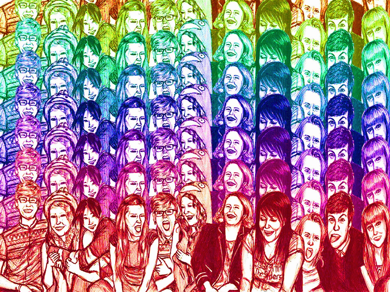
2nd Set; Same images and placing, with the titles removed and the multi-coloured diamond pattern of the one large group drawing put into the background instead. The backround represents the title in this case, because in the diamods you can see what looking like people having a party, therefore the poster says "Celebrate".

 1. 2. 3.
 
 4. 5. 6.
 
 7. 8. 9.
 
 10.11.12

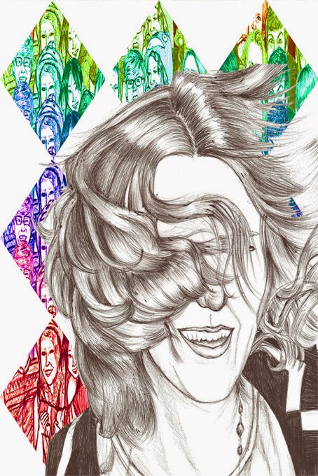
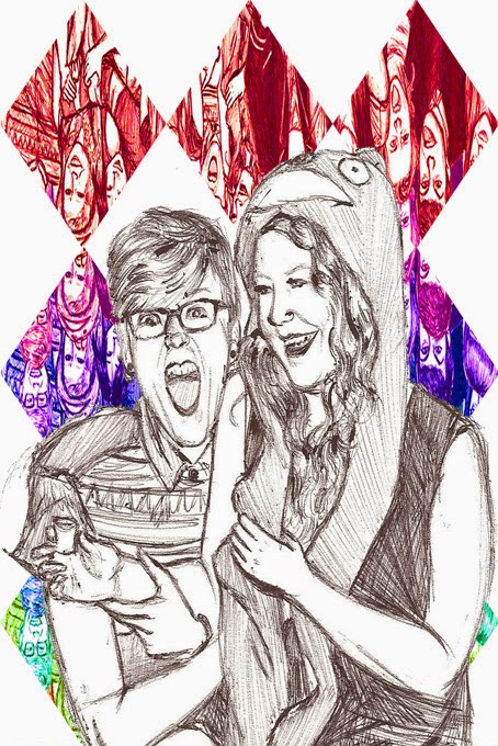
The most complicated set of posters, with the faces, background and titles all put together. I do think the result is funky, but I decided the simpler approach was better. The posters are funky, but up close they're complicated and a bit hard to read due to all the colours. So I decided my final set of posters would be the 2nd set, with just the faces and the diamond backgrounds (With the exclusion of numbers 5 and 6).
 

Monday, 19 May 2014

Pathways Project - Celebrating The Ballpoint Pen 8

"Applied Design Crafts" Final Piece (Plan)
I looked into the idea of drawing my celebration images onto clothes and of setting them up so the images were symmetrical.
Zoe on both wrists

Catherine on the centre of the back would have been the only part that wasn't symmetrical.
I only managed to make a start on drawing on the shirt when I had to move on however.
 
Funky bed sheet pattern made up of different images


Final Pattern Designs Inspired by the bed sheets above; I used the idea of creating a pattern out of already set images, I used the finished pattern designs I'd made in previous posts

I think is my favourite design so far, one I would have loved to make onto a product for my final piece, most likely furniture; couches, pillows, quilts, bed sheets, curtains etc.

Pathways Project - Celebrating The Ballpoint Pen 7

Cele-BRAT!
 
I made the letters for "Celebrate" out of the colour patterns from my first post of "Celebrating The Ballpoint Pen", to see if I can make a poster of sorts for my "Visual Communication" Final Piece (plan). A poster that simply represents the word and feeling of celebration with just the images and with as little writing as possible. So I made the "Celebrate" Title above to use.

Combining "Celebrate" to my pictures of Catherine to make a basic poster

 
Different colour schemes for "Celebrate"

 
My Groups of people drawings and poster designs combined with "Celebration"
 
 1.
I quite like this design, its quirky

 2.
This ones also combined with my multi-coloured patterns from "Celebrating the ballpoint pen 5)

 3.
combined with more multi-coloured patterns from part 5; this one's way too much however

 4.
A simpler one, like the 1st one (above)
 
 5.
Another one that's too much

 6.
Despite the fact that I felt whenever I combined the group drawings with the multi-coloured patterns of Catherine, I genuinely wanted to make a multi-coloured design, so I decided to make a multi-coloured pattern with the group drawings. I really love the result on its own, but I'm not sure how I can combine it with "Celebrate" without making it too much

 7.
I actually like the result better than I thought I would; I cut out the centre and inserted the "Celebrate" titles in the blank square (inspired by my portrait border with Catherine in the centre; from part 6)

 8.
Diamond pattern; I like the mix of white with the multi-colours and would love to find a use for this
 

Pathways Project - Celebrating The Ballpoint Pen 6

Here's one I meant to add in earlier!
(And the only reason i didn't just simply add it on to the Catherine entry was because I didn't know if people would look back over ones they'd already looked at, so in other words, I wanted to make sure people could see it)
 
Contemporary Art Final Piece (Plan)
1.
 
These are my drafts ideas for my contemporary art final piece (In other words, these are what I would have done if we needed to do the final pieces); a pen drawing of my friends celebrating. Basically I'd take the drawings/photos I'd already done, and put together a scene of them having a party and these are the four designs I came up with. I would use just pen again and draw the entire scene on A2 or A1 sized paper, more drawings on one page and in bigger scale.

 2.
 
Zoe (Right) would actually have her shot glass this time)

 3.

 4.
 
my favourite designs were 2 and 4, so if I had done a final piece I would have done either of them if not both.

Sunday, 27 April 2014

Pathways Project - Celebrating The Ballpoint Pen 5

The Last Drawing!
Another one of Catherine and her fabulous hair (couldn't resist), I figured, once again the messy flying hair suggests movement (dancing) but also because she's facing straight forward, I thought it could possibly be used as a centre piece for poster experiments.

I couldn't pick one colour that suited her best, I liked them all, which gave me inspiration for the next picture. (Below) Not sure if she's zooming forward or backward, could be either, I genuinely love the result, funky as hell, could possibly be used as a poster (But it would likely be a complicated poster; probably hard to read the words if I put any on it. however, I'll still experiment with it, because I do like it.)

Second experiment; Colourful symmetry! once again, a really bright funky result, however still over the top. however it would still definitely make an awesome Technicolor dream coat; why have just plain colours when you could have a fabulous face and hair on it too?


Further back, the patterns look more curvy (Her hair), which I think is pretty because of that.

The more duplicated the pattern is, the more neon it appears, funky as hell, could possibly be used for an outfit, however all the colours make me think of candy wrappers; bright, colourful and appeals to children.


Pathways Project - Celebrating The Ballpoint Pen 4

Another set of drawings, this is Zoe; having fun, either smiling, laughing or just making a silly face for the camera.
Coloured Zoe; I just went with this colour because I thought it suited her.
(Below) Another attempt at a pattern using just the one drawing (Like the one of Catherine).

First attempt; Pretty funky.

This one above is a bit freaky, if u look at the centre figures, you'll see their faces are messed up; I just used symmetry of the previous picture to make this pattern, and this is the result; a little freaky but still funky.

Attempts at combining another set of patterns (still of the same image) to the coloured one; these are probably my least favourite patterns so far, I'm not sure if I would go any further with it, however I do still like the individual drawing of Zoe.


She should be holding a shot glass on the left, but it got cut off as I scanned the drawing in. I'm disappointed about that because that's partly why I drew this one; I figured the shot glass further conveyed the party theme. However, she still looks like she's having a good time (Did not make any Photoshop experiments of this drawing on its own, hence why I'm just adding it onto the Zoe experiment entry).