"Visual Communication" Final Piece(s) (plan)
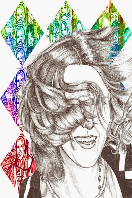
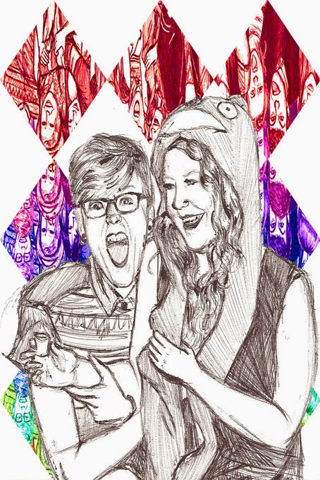
I decided that instead of one poster featuring a bunch of group drawings, I could make a series of posters instead. Above is the 1st set, basic design, just the individual drawings with their own coloured "Celebrate" title; a couple have been repeated with slight differences in the positioning of the figures as an experiment to see which ones looked better.
2nd Set; Same images and placing, with the titles removed and the multi-coloured diamond pattern of the one large group drawing put into the background instead. The backround represents the title in this case, because in the diamods you can see what looking like people having a party, therefore the poster says "Celebrate".
The most complicated set of posters, with the faces, background and titles all put together. I do think the result is funky, but I decided the simpler approach was better. The posters are funky, but up close they're complicated and a bit hard to read due to all the colours. So I decided my final set of posters would be the 2nd set, with just the faces and the diamond backgrounds (With the exclusion of numbers 5 and 6).
The most complicated set of posters, with the faces, background and titles all put together. I do think the result is funky, but I decided the simpler approach was better. The posters are funky, but up close they're complicated and a bit hard to read due to all the colours. So I decided my final set of posters would be the 2nd set, with just the faces and the diamond backgrounds (With the exclusion of numbers 5 and 6).


No comments:
Post a Comment